The Quick and Dirty on Data Visualization
By: Nancy Duarte
Source: Harvard Business Review | Posted by Datatribes on August 19, 2025
Data Tribes Curated Summary & Key Takeaways:
1. Am I presenting or circulating my data?
Context matters. In live presentations, keep it simple and focus on big-picture conclusions (trends, comparisons).
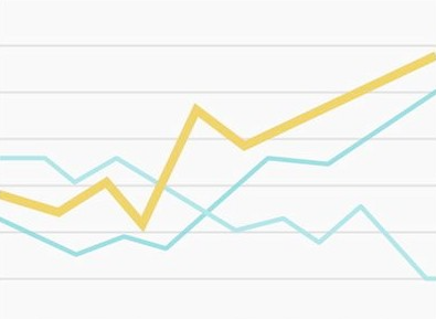
Use subtle grid lines and neutral colors so the highlighted data point stands out. For documents or decks shared by email, more detail is acceptable — but structure, white space, and hierarchy are key to guiding readers.
2. Am I using the right kind of chart or table?
Choose visualization types based on what relationship you want to emphasize:
- Pie charts: Show proportions of a whole (e.g., one investment dominating a portfolio).
- Bar charts: Better for comparing categories side by side.
3. What message am I trying to convey?
Visuals should guide attention. Avoid charts where everything has equal weight — they confuse rather than clarify.
Use color, emphasis, or hierarchy to highlight the most important message (e.g., revenue drops by region and time).
4. Do my visuals accurately reflect the numbers?
Avoid clutter, excessive effects, or 3D distortions — they can mislead or obscure actual values. A simple, flat chart often communicates numbers more clearly and honestly than flashy visuals.
5. Are my data memorable?
Even accurate visuals can be forgotten. Use visual metaphors or creative demonstrations to make insights stick. Example: Michael Pollan illustrated the oil consumption of a McDonald’s burger using glasses filled with “oil” (chocolate syrup), creating a tangible, emotional response.
Key Takeaways
- Adapt your visual approach to the context — live presentations need simplicity, while circulated documents can hold more detail.
- Pick the right chart type for your message: pie for proportions, bar for comparisons.
- Use emphasis and color to highlight the story, not overwhelm with noise.
- Avoid distortions — clarity and honesty are more impactful than flashy effects.
- Make visuals memorable through metaphors and storytelling to drive engagement and recall.